Lifestyle
Rally Obedience Training App
Rally Obedience (or Rally-O) is a beginner-friendly dog sport that, in theory, just about anyone can do with just about any dog. But in practice, training for and competing in Rally-O can be overwhelming and lonely.
This social media app allows dog owners who are training Rally-o to intuitively organize, plan and track their training sessions. It aims to build a community where users can friend, follow, and interact with each other via the usual social media things and by “remixing” other users’ training plans.
I’m the sole creator of this experimental project, from idea generation to research to prototyping to testing. A Rally-O trainer myself, I kept looking for something to meet my needs, and nothing ever did.
Ideas and Research
I scoured the internet. But all I found was-
A few online courses/videos/Facebook groups
Some note taking print-outs
Several hideous apps for memorizing the signs
With that done, I made an interview research plan, which you can read here. I wrote out a script for the zoom interviews.
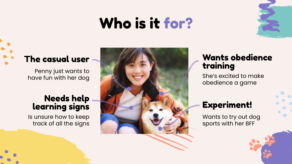
What surprised me is everyone else talked about their frustrations with finding or staying connected with the Rally-O community. 2 out of 5 of the participants had no other people training Rally-O near them, making them feel isolated and lonely. Meanwhile the other 3 valued their local communities, but were frustrated by how often they could not meet, due to schedules or COVID-19 or whatever else life smothers us with.
Sure, organization was still a huge issue. But through these initial interviews, I realized what people wanted was fun, personal organization that could be shared within a close-knit community.
From the research presentation I created for these initial interviews
The app I had in mind originally was very plain and business-like. But users didn’t want that. They wanted fun, connection and organization all rolled up into one.
First Round of Ideation Post-Interviews
So first things first, I nailed down our How Might We…? Questions. Distilling the words of my interviewees into 3 problems to solve. I landed on:
How might we break down the learning process into easily teachable chunks?
How might we help people understand their dog’s immediate needs during the training process?
How might we help people feel less isolated as they teach their dogs Rally Obedience?
Once that was done, we were off to the races. 3 big problems to solve. 3 solutions to narrow down to.
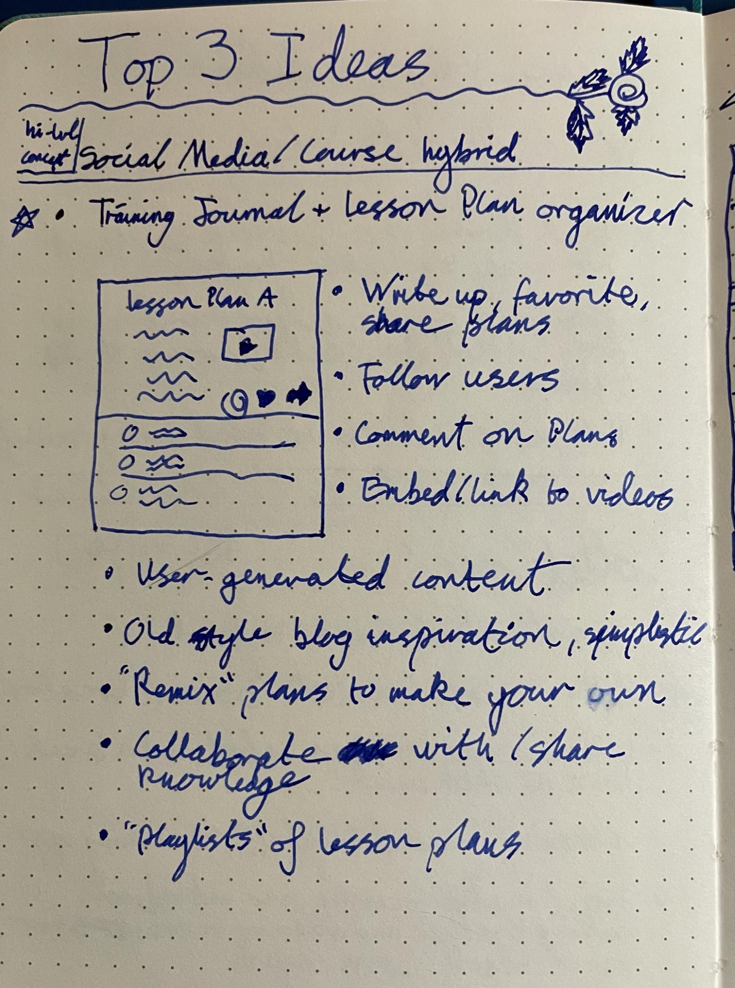
Training Journal + Lesson Plan Organizer
My first idea was something along the lines of Tumblr, if Tumblr entries focused on building lists rather than text posts. And yes, I do realize Tumblr isn’t research or learning focused, but this wild card felt… Right.
The app starts with building your own lesson plan through searching and selecting the right signs. Then sharing your plan (if you want), sharing other people’s plans, and being able to “remix” other people’s plans. Essentially, “remixing” would allow a user to take another user’s published list, tweak it how they like, and make it their own. Change out a sign, or change the order, or whatever the user needs.
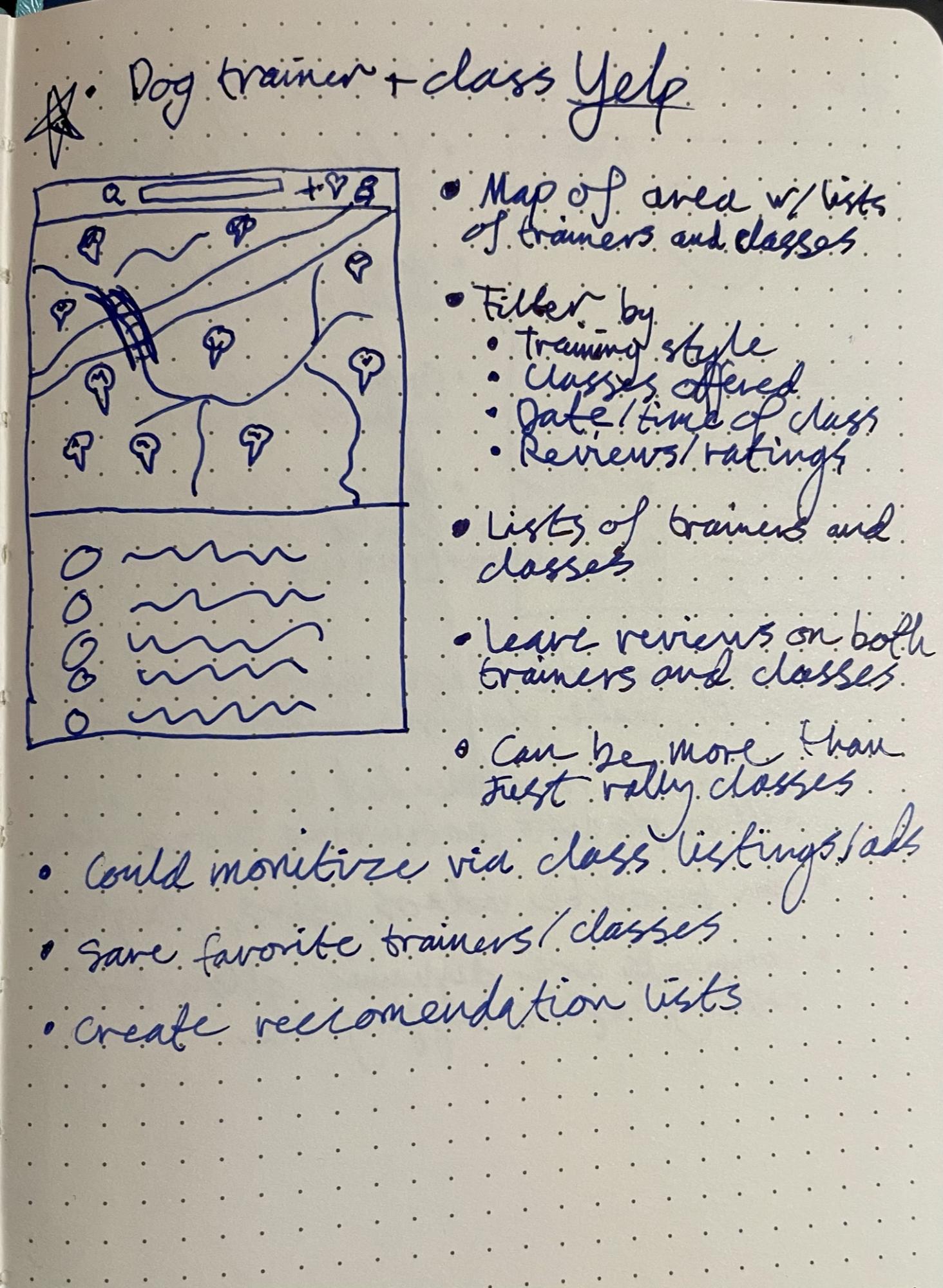
Dog Trainer + Class Yelp
First I need to say that I think using Yelp as an inspiration for a dog thing is super funny. Yelp, like a dog yelps? Yeah. You get it. Look, accidental puns amuse me, ok?
This one was actually inspired by a direct quote from one of my interviewees.
“I have trouble finding trainers and classes in my area.”
As much as I like this idea, I think it should be for all dog training. Just because you google “dog trainer” doesn’t mean you’ll find the good stuff.
Someone should absolutely make this. Maybe me someday. But it shouldn’t be limited to Rally-O. Thus I think it falls well outside the scope of the pertinent issue.
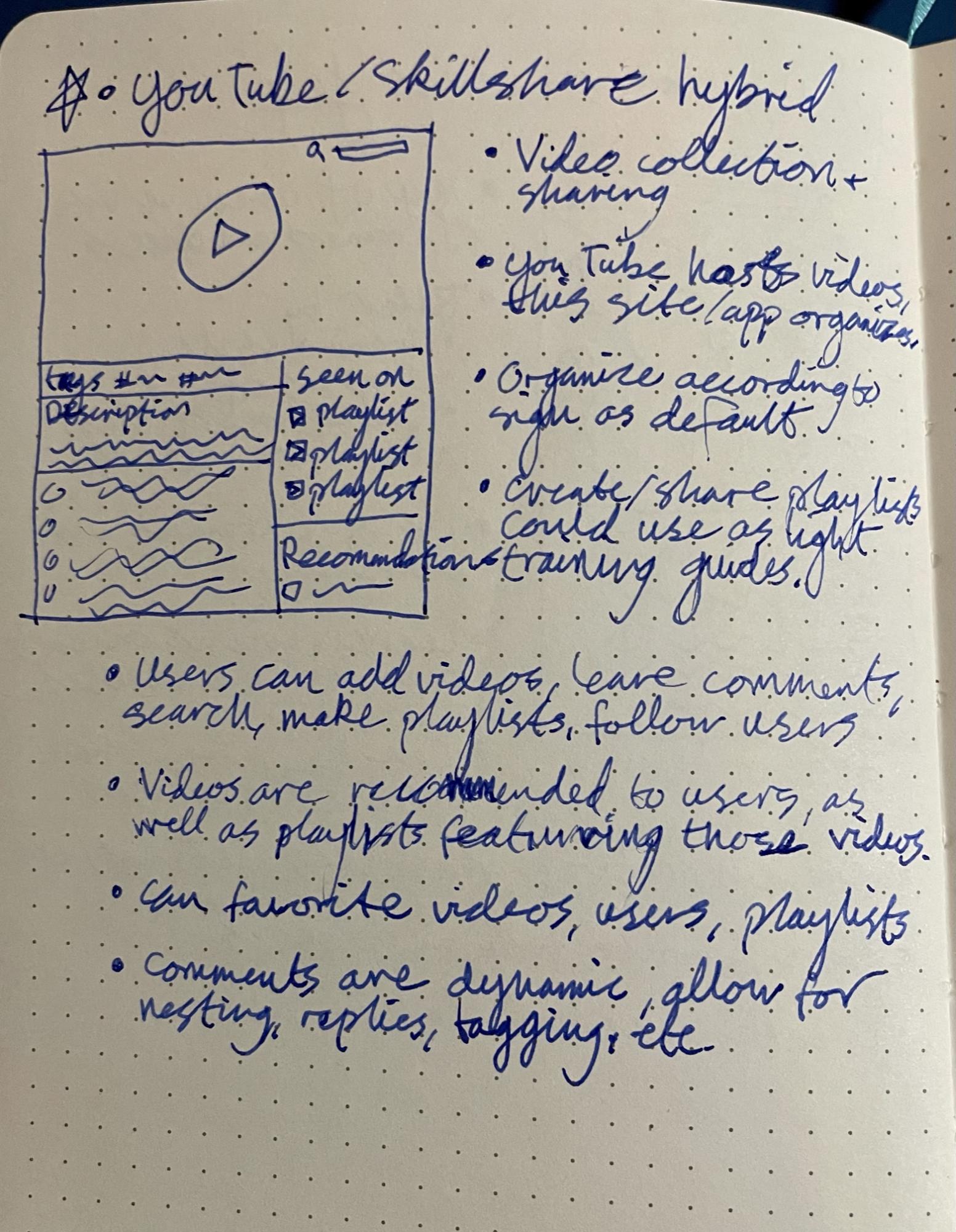
YouTube/Skillshare Hybrid
The last of the 3 final sketches for this round is named super weirdly, so please withhold judgment for just a moment (you can keep judging the earlier research plan formatting, that’s fine).
The content would be from embedded YouTube videos. The way we display and interact with them would be where the magic blossoms.
Videos would be categorized by the signs they cover, sign numbers and levels of signs. All the details right there.
It also lets users create playlists and facilitates conversations around the videos.
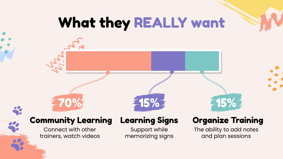
But Which One is King?
I only have so many brain cells, so I needed to pick just one of these ideas. I already knew which I liked best. But my last guess about what my audience would like was only 15% right (see “What they REALLY want?” graphic above), soooo… I ran a quick guerrilla test in the same Facebook group as before. Let the people decide.
“Hey y’all, which of these are you most excited about using?”
“The first one!” said literally everyone.
SO. With that encouraging spark of “you’re on the right track!” we began our journey.
Mapping the Flows
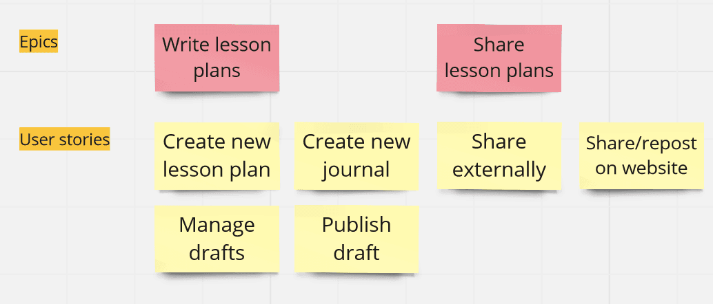
For this project, my best overall mapping solution ended up being user stories, laid out in Miro.
Now, to be clear, I don’t think any developers on any UI/UX project I’ve ever worked on would look at these user stories and be pleased with them. But for me, this worked.
The Red Routes
You can tell this is when I finally discovered Miro for iPad. The scribbles!
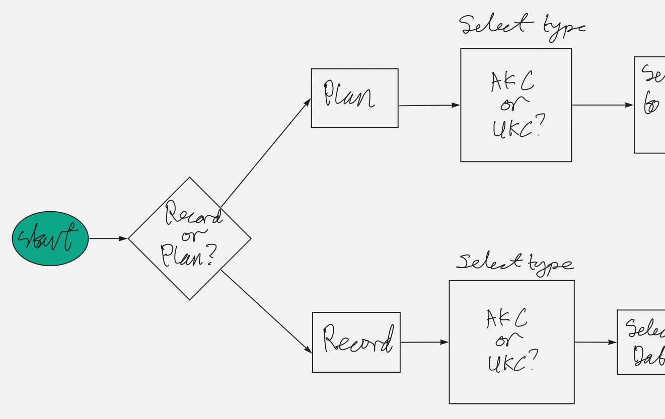
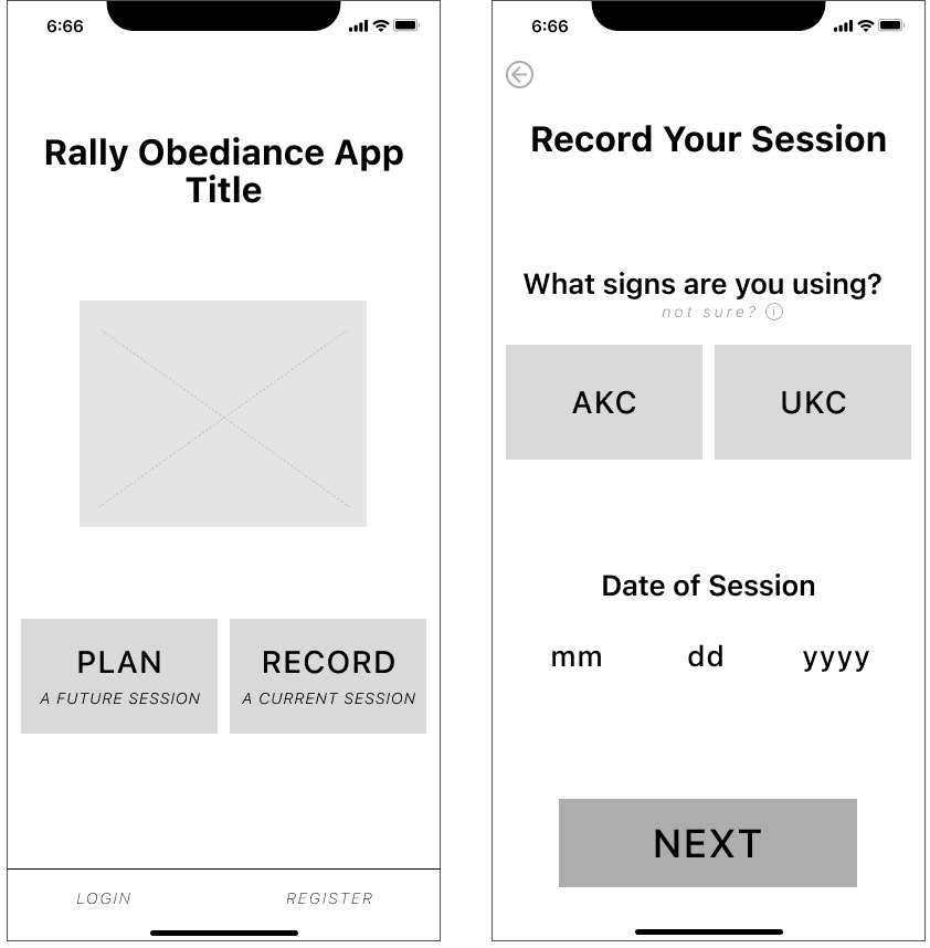
The premise of this app is to simplify a complex process. So I need every step to be crystal clear and stupid simple. At this point I’m thinking that folks would have two different need states.
Wanting to plan a future session
Wanting to quickly jot something down during or immediately after a session
Hence the “plan” and “record” pathways. The primary difference being that a “planned” session would not have a date on it, and could be saved as a template to follow many, many times.
Let the Sketching Begin!
So right off the bat you can see my… terrible dog sketch. I swear I’m better at drawing dogs than this. But oh well.
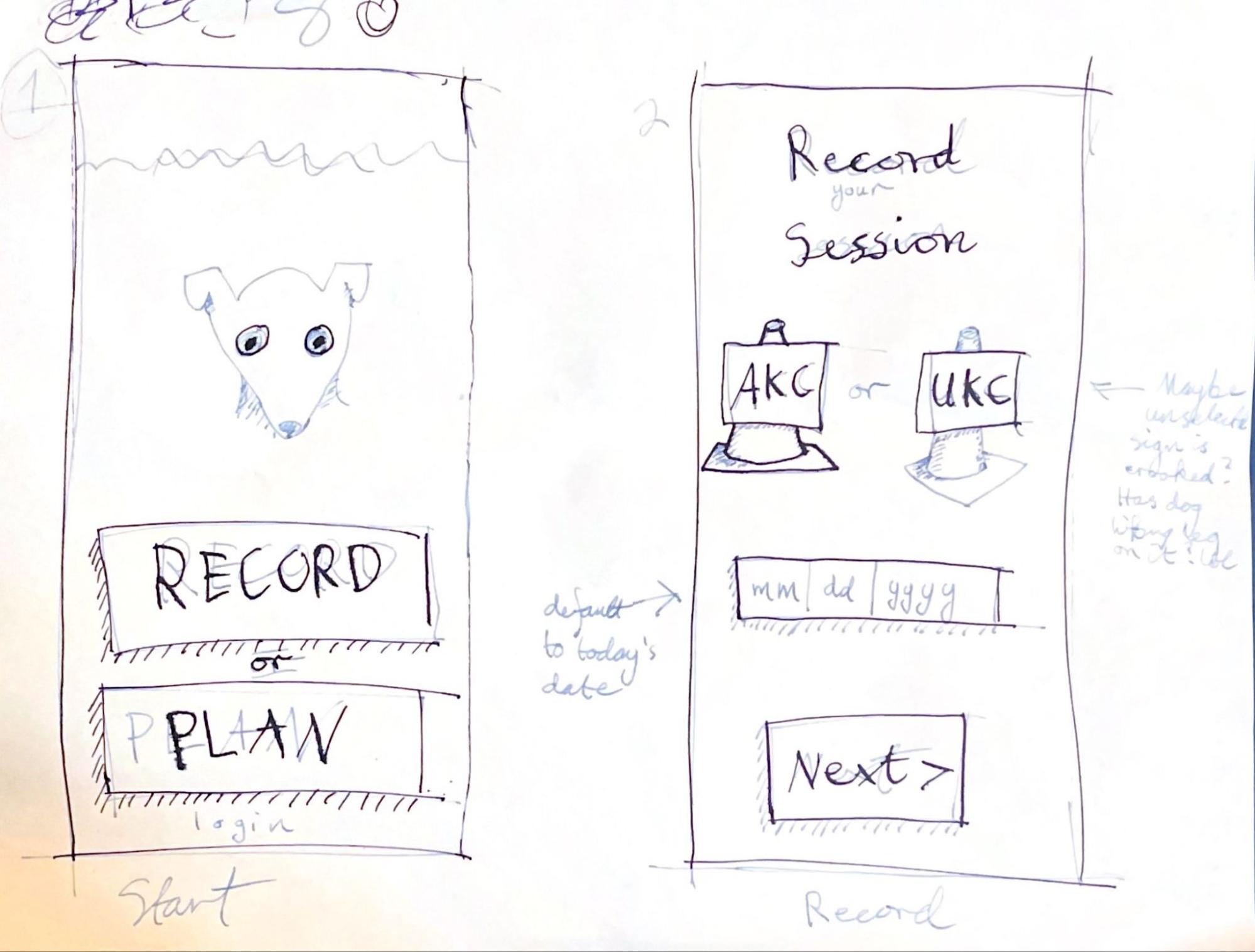
Above is my start page. If they click Record, they’ll see that next sketch.
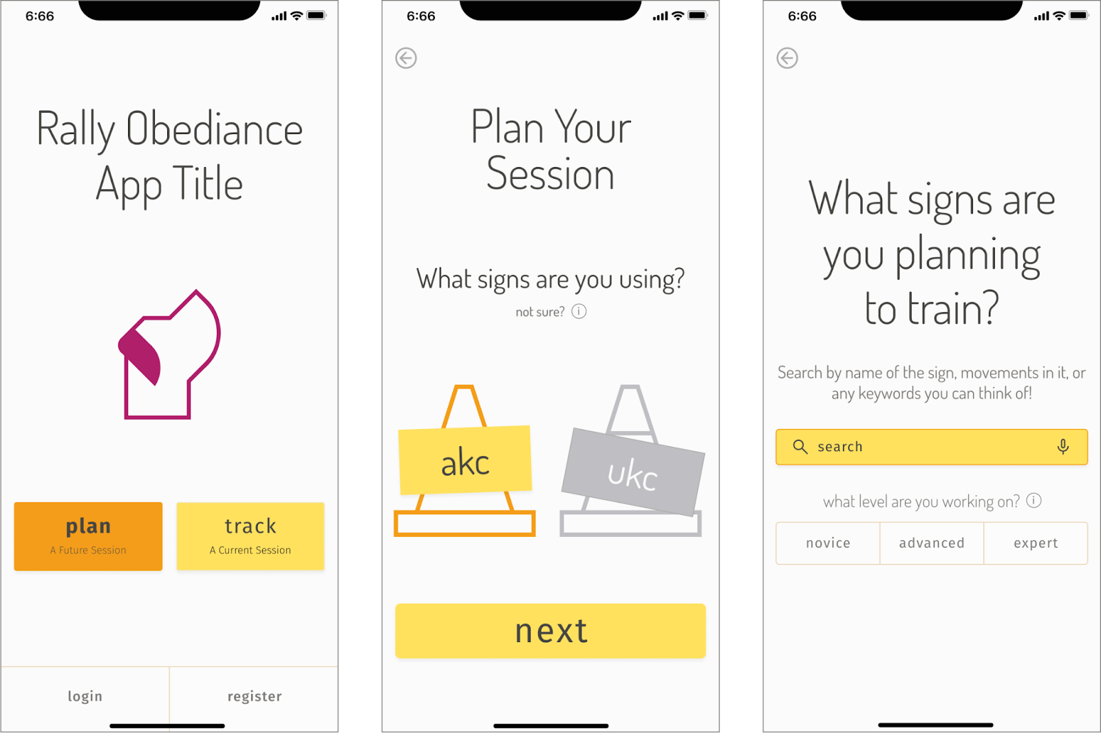
Note: There are two entirely different organizations that run their own versions of Rally-O. AKC and UKC. They are nearly identical in rules and problems, but with DIFFERENT signs. 2 out of 5 of the folks I spoke to were competing in UKC. I had really thought we only needed AKC, but clearly I was wrong!
I like my cute little cones. Mimicking the look of the cones on the Rally-O course, as safety cones with signs on them. Heh.
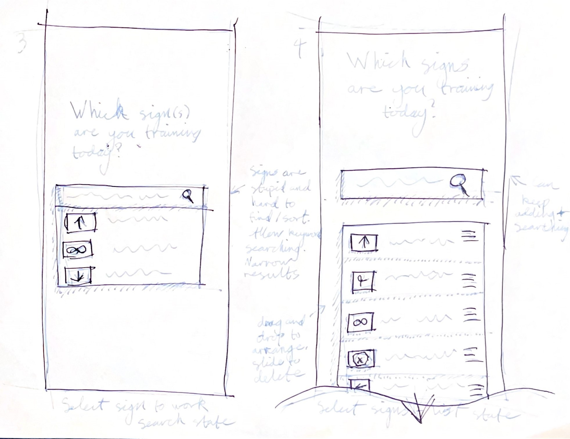
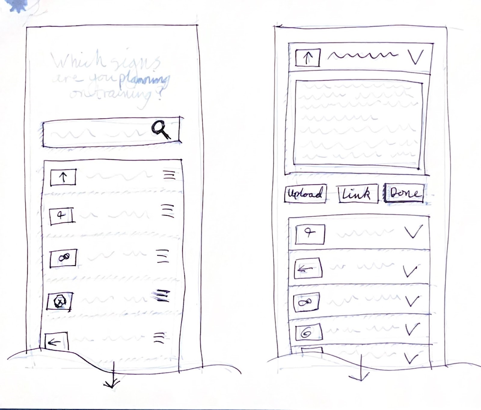
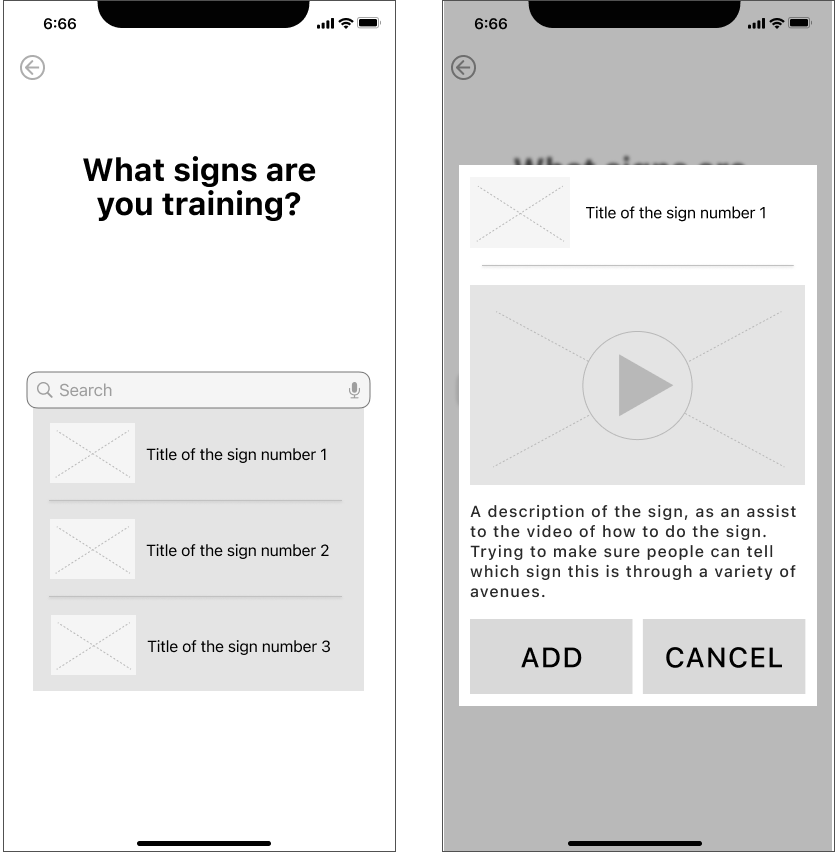
Still in the record flow, we move on to the search page. Because the signs are difficult to remember how to identify, the search needs to allow for extremely broad searches. I made a note about that, where when you start a query, it pulls up many results which steadily narrow down the more you type. You may already be able to see the issues I ran into with this page down the line.
The signs are listed with both their image, and the title people tend to call it by. Which is usually just the words on the sign.
As you select signs, they slot into a list below the search bar. You can keep working in the same flow of search and select, while your list grows. Again, I was aiming for absolute simplicity.
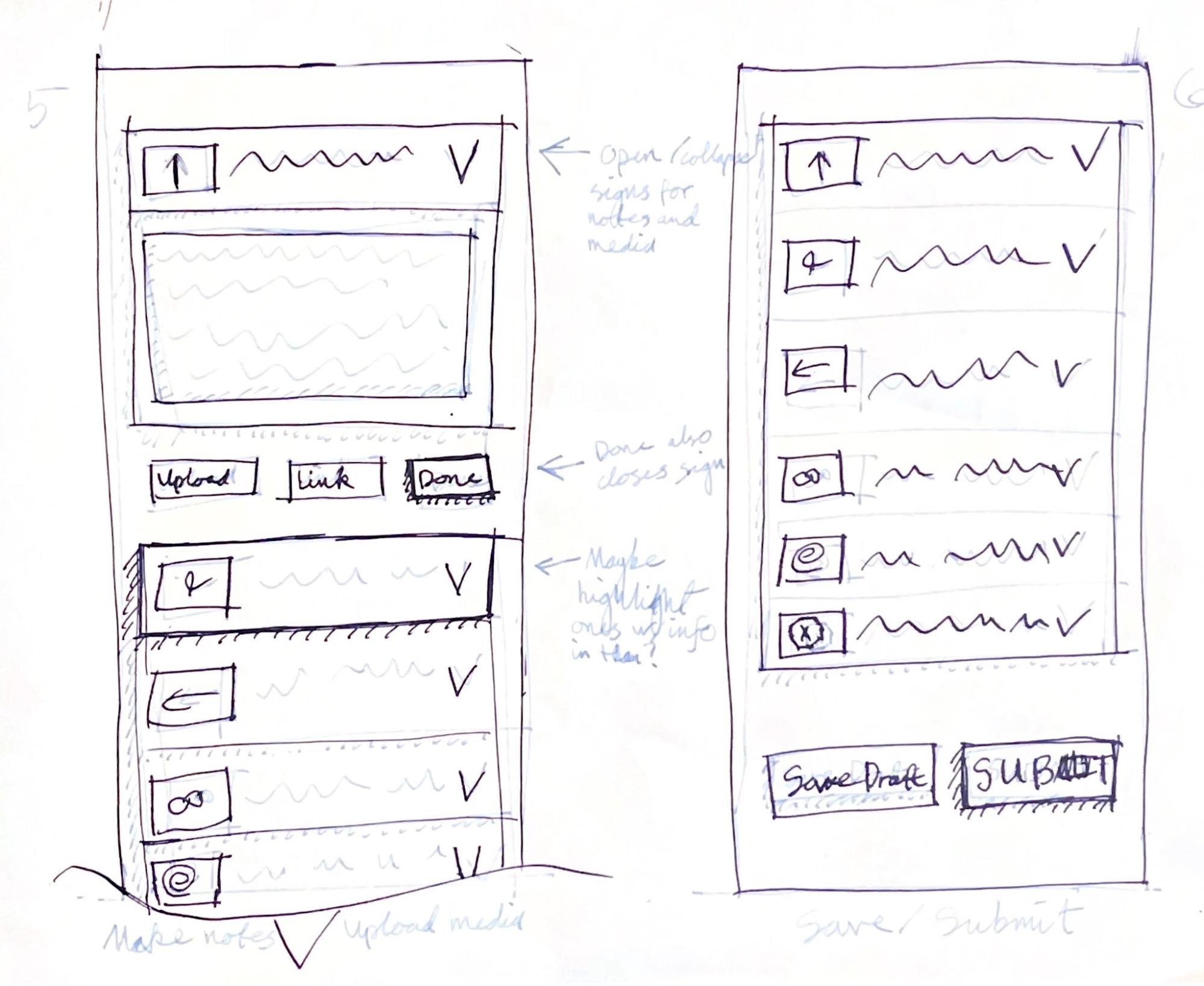
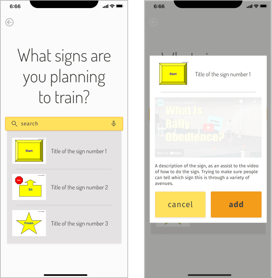
Here the sketches start to show the details you can view and edit in the list. You can keep it as simple as the plain list from the last sketch, and at the bottom of your list, you’ll just see the right sketch. But if you tap on the entries, they drop down into a box that allows for you to input your notes. The upload button is intended to be for uploading your own photos, and the link button is for linking YouTube videos. Why yes I am aware that wording makes no sense. Which is why this changes pretty quickly in the next few stages.
However, its inclusion was inspired by the number of interviewees who talked about videoing their training sessions, then watching it back later to figure out how to self-improve. They also tend to share videos of their sessions for other people to watch and critique. So some form of media inclusion is desirable. This was just my first whack at it.
As for having the two different buttons at the bottom, to either save draft or submit, I figured folks would like an option to just save as far as they’ve gotten, but not let anyone see it yet. Meanwhile if they’re done, they can submit it and have it published for other folks to see.
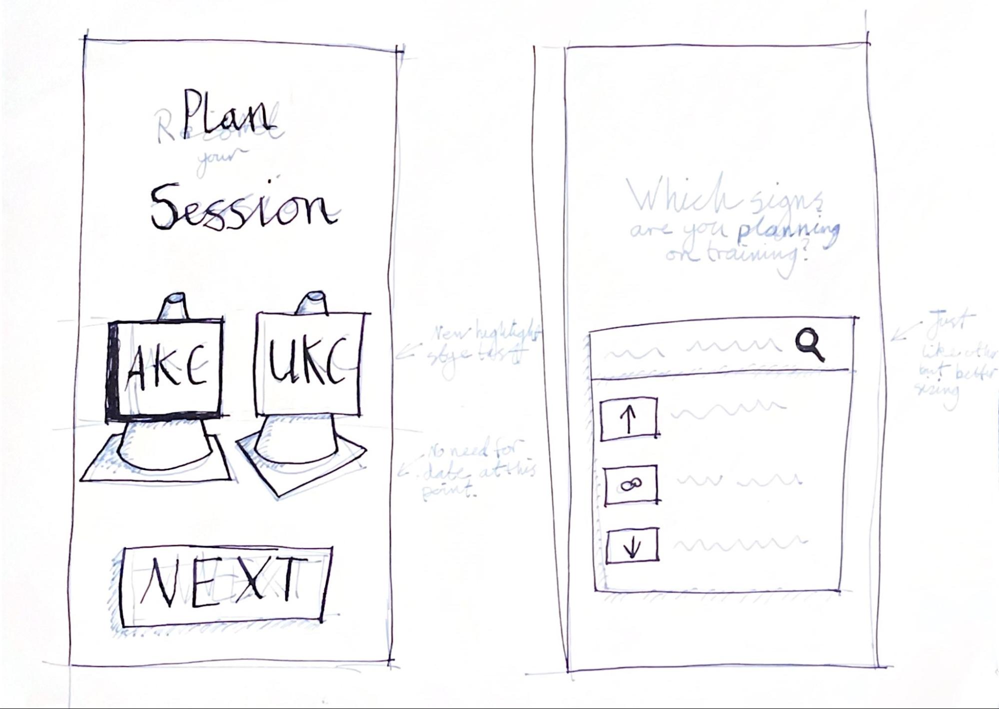
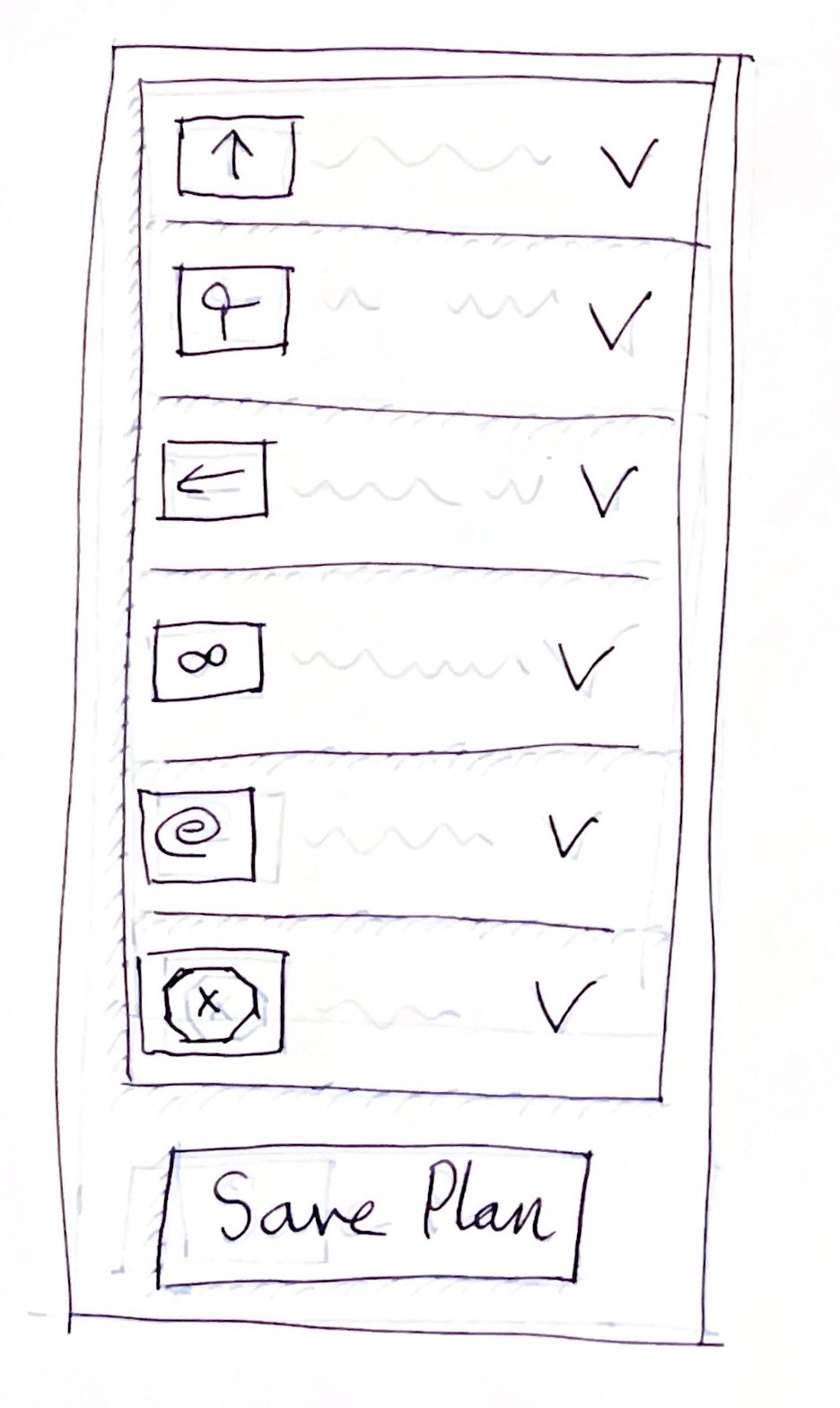
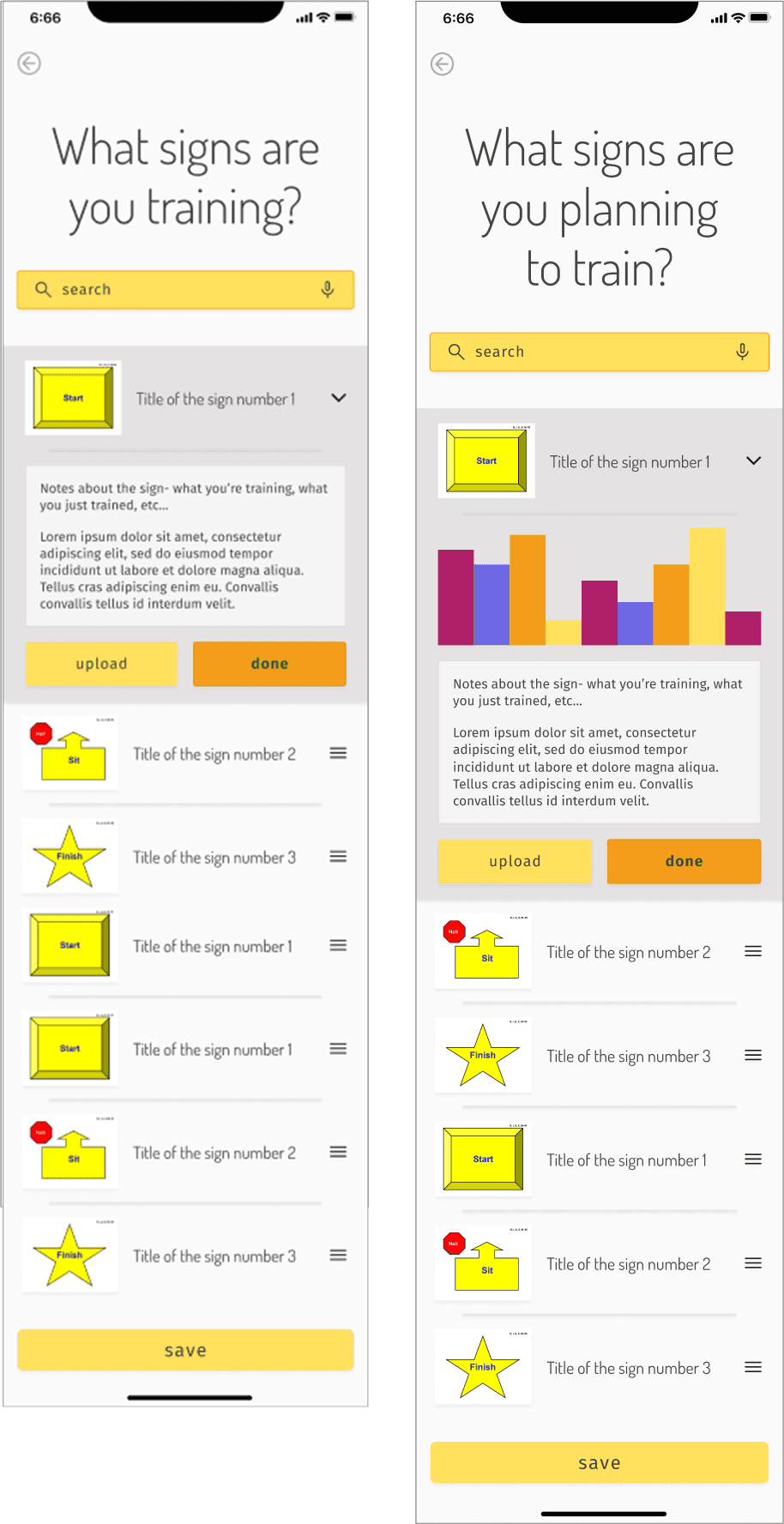
Now we backtrack to look at what the plan selection would show us. For the first few bits, it’s extremely similar. The only changes are the wording, and the lack of date selection. Again, this was decided because this plan wasn’t intended for one specific session, but more as a template for as many sessions as the user wants.
Again, the next few sketches are near dupes of the previous flow.
But finally, we see there is only one button for saving the plan. These plans were not intended to be public. Just private templates for your use. So there is no need for the distinction between draft and published.
First Usability Test
We got these sketches straight into the hands of users. Well. More like I created a tiny prototype out of them using POP by Marvel and then tested them.
I snagged 3 of my extended family members, explained basically how Rally-O works, and had them give it a go.
Findings
The first and biggest problem is there is no back button in any of these sketches. This seems like such a “WELL DUH” thing, but here we are.
Additionally…
Users did not understand the majority of my more unique buttons. The “upload” and “link” buttons were especially confusing. Upload and link what?
Users wanted to see more information about the signs themselves during the search and selection process, to make sure it was the right sign.
At least one user wanted to see data about how their dog has done on the signs in the past. That would require creating metrics that I hadn’t researched or planned for. I was also unsure of how a dog’s performance could be tracked in a useful way.
After brainstorming some solutions to these problems, I moved on to-
Wireframing
Record Flow Wireframes - First 2 frames
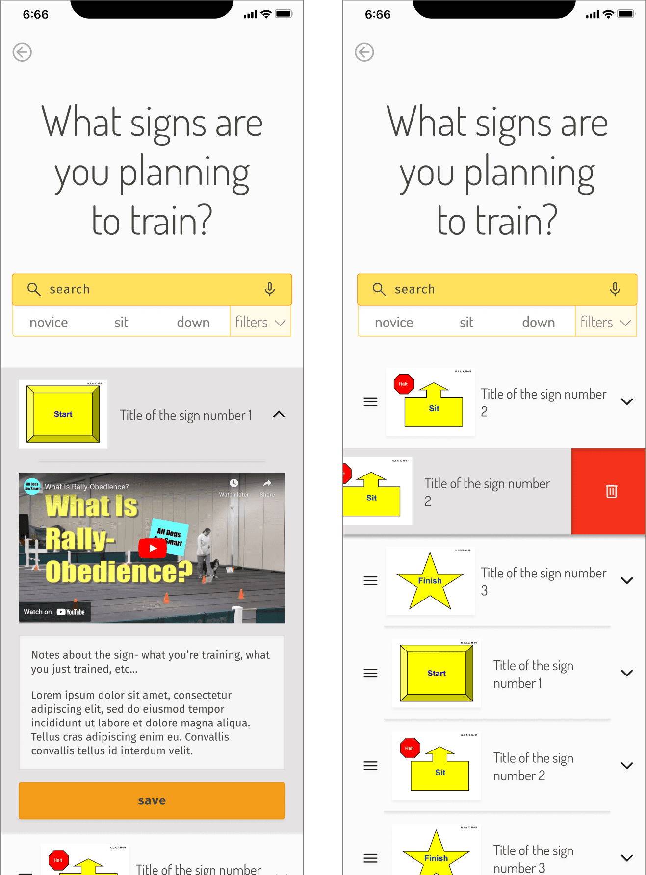
To solve some of the confusion around AKC and UKC, I added a tooltip. I also added some better search functionality by allowing searching individual moves contained in the signs overall movement. So for example, searching “down” would pull up all the signs that contain a down at some point in the movement.
To give more information about the signs, when adding signs to a list, I created a pop-up that shows a video and description of the sign performance, then asks if they want it or don’t want that one.
Record Flow Wireframes - 3rd and 4th frames
In this iteration, I did far more list functionality work. Showing how to delete the list items, suggesting that the list will work exactly how you think it will on mobile.
Now, the request for more info… I thought a graph might work. But at the time, my thought was that it doesn’t make much sense in the record flow. Because if you’re just recording what’s happening, you probably don’t need data from the past.
< - Record vs. Plan list views
For the plan flow, however! I added a graph to the note creating part of the list building process. My thought was that the data shown could inform the notes the trainer put in the template. However, I did not create any UI for what that data might be.
My concern with spending time on this was I only had one person mention wanting data this detailed. Other folks seemed to mostly want to jot down a sentence or two about the session. Not try to rate their dog’s performance.
This caution ended up working in my favor, as it was dropped entirely as more feedback rolled in with later tests.
Style Guide
One of my favorite parts of the process! I adore colors and creating aesthetics. My goal for this style guide was to create a feeling of friendliness, fun and relaxation.
During the initial interviews, 4 out of 5 of the interviewees wished they had more fun with Rally-O. Not that the sport or community themselves were the problem. Rather, they found themselves taking it far too seriously.
Rally-O is supposed to be fun. So I wanted to make sure the app felt more like a cute game than a serious to-do list. Hence bright colors and soft, plush UI.
Photo Style
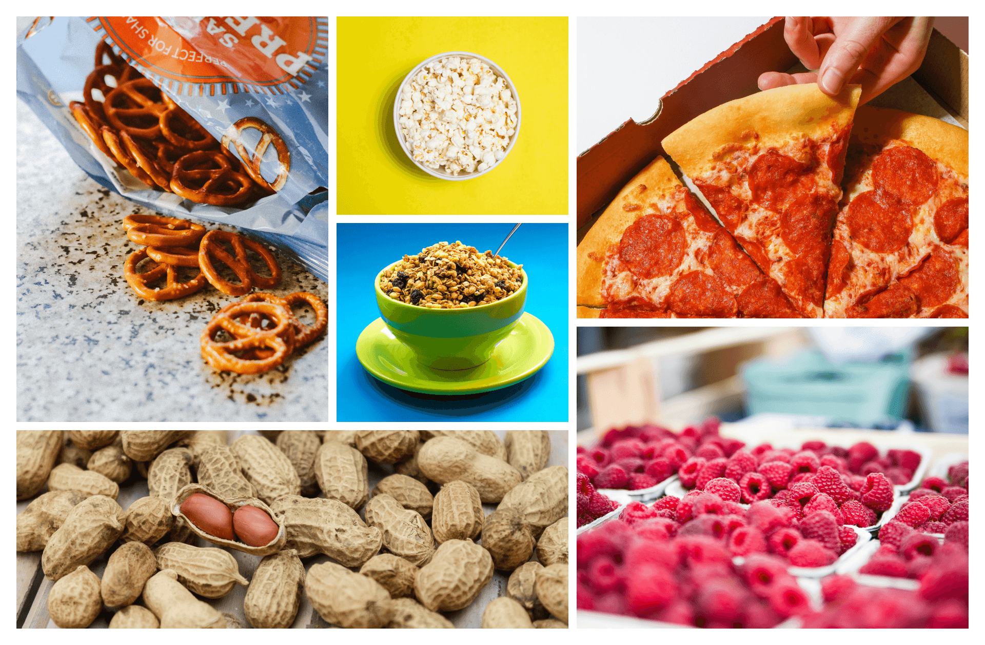
Don’t mind all the food images. I guess I was hungry. But what I was looking for was the feeling and the colors of the images. It should be fun and relaxed. Like a snack, I guess.
Anyway… Odd subject choices aside, this did ultimately help inform the guide. I was avoiding real images of dogs for the app anyway, because again, I want to preserve that playful, “this is a game” feel. And I think using icons and/or little sketches instead of photographs will help that feeling. Speaking of which…
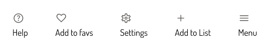
Icons
I only chose a few icons to represent my vision, but I already had a pretty solid library of what I wanted in my head. It was good to start finding them in the real world and collecting them for use.
Color!
My favorite part! Color can make or break a design. For this, I was determined to have playful yellow and orange base colors that did not feel like crayons. An adultly colorful palette, if you will.
I wanted the contrast colors to be rewarding and bright, but again, without feeling harsh or childish. My success and error colors could be a little more vivid, since they do need to catch attention. And besides- what game keeps a subdued “you have succeeded!” and “you have failed!” notification?
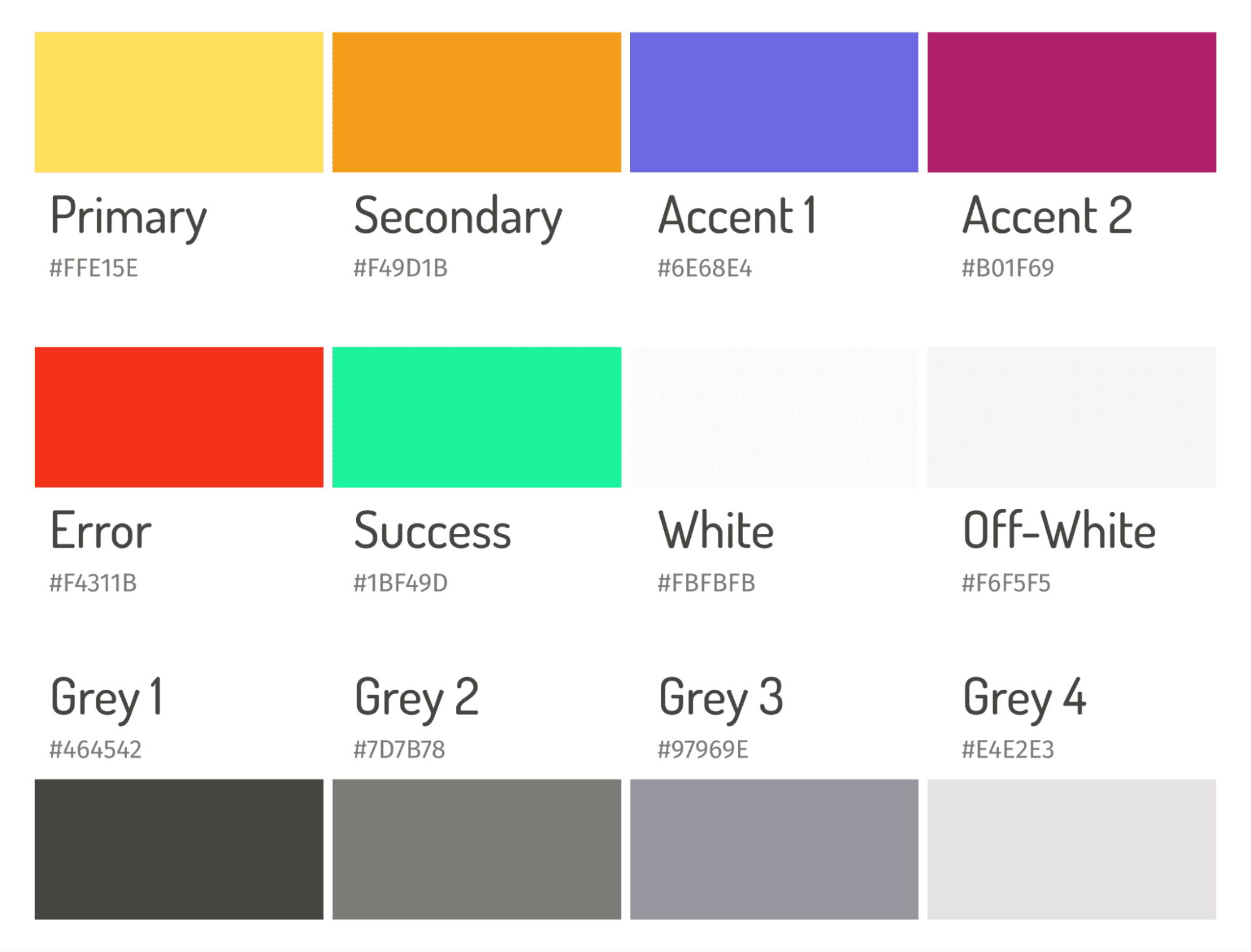
I included a grey gradient, for subtle definitions. Also, in an effort to erase boring #FFFFFF from the app, I selected a new “white” to use as the baseline. I also included an off-white color for more definition options.
UI Elements
As you would expect, this section expanded the most as I worked through my designing process. As I designed new pages, buttons would be tweaked, or new variants, or even new elements altogether. The whole style guide grows organically, as it should. As of right now, this is where we’re at.
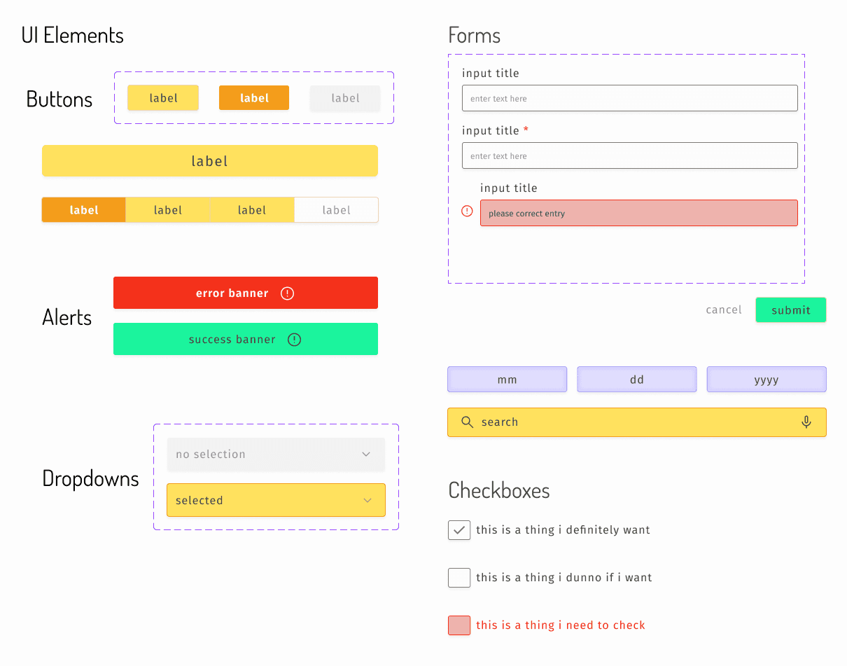
I aimed to keep the UI style feeling soft and touchable. It’s bold, but not demanding. Soft, without feeling indecisive. It will playfully guide you through the process, without making you feel overwhelmed. Big buttons, bright colors and laid-back font Dosis help achieve the overall mood.
Fonts
For my headers, I used Dosis. For the body, I used Fira Sans. For sizing, I very nearly straight copied from the iOS guidelines. I made a big ‘ol font reference sheet, which was helpful for Figma style guide stuff, but man it’s hard to process with your human eyeballs. As per usual for big ‘ol font sheets. You can see the whole sheet here, but I’m just including some excerpts so it’s easier to see in this doc.
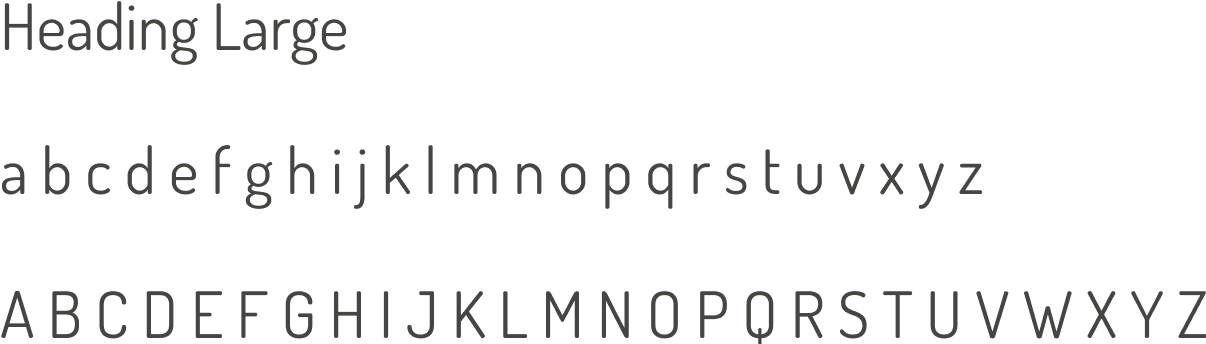
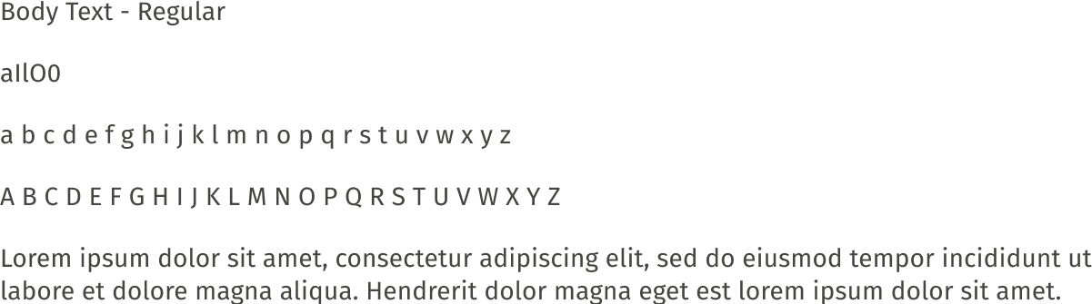
I also made a set of text colors, with a very fine difference in shades. But it made for some lovely gradients in the sheet and the pages.

You can view the full style guide Figma file here.
High Fidelity Mockups
From black and white, to style guide, to finally! The first in-color mockups. This feels like one of those old movie trailers bragging about being in Technicolor. Anyway…
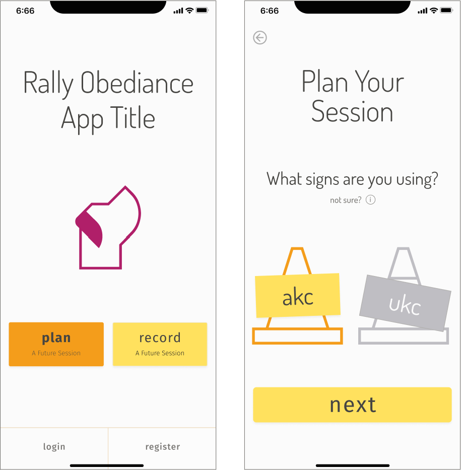
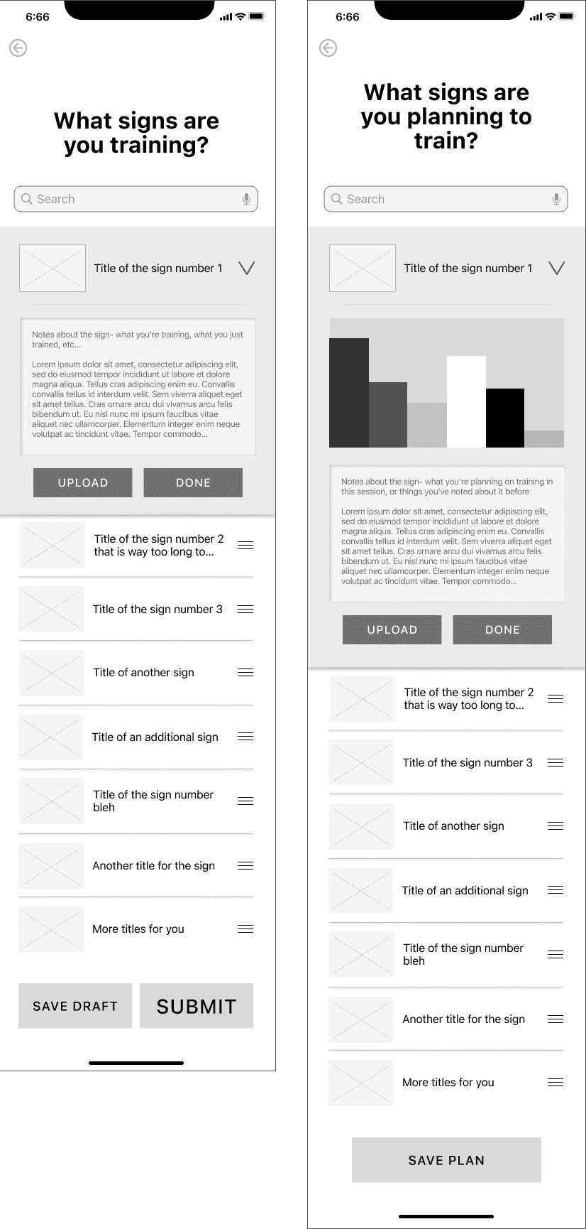
Plan Flow Hi-fi Mockups - Screens 1 and 2
My primary mustardy color is used for important elements. The darker orange buttons in the mockups are indicating where the user is clicking to get to the next page. In the actual app, it’ll show as the user taps down on the button.
I used large icons as art rather than photos. This matched the safety cones I hand drew.
Plan Flow Hi-Fi Mockups - Screens 3 and 4
The plan flow is of course also similar, but here I colored the graphs using all the main colors I created
<- Record vs. Plan List Building Mockups
Prototyping and Testing
Figma has pretty good prototyping tools, so I utilized those to help make the pages interactable. It’s not a perfect prototype, but it does a nice enough job.
To prep for testing, I created a single page test plan and a script.
User Testing - Round 1
For the first round of tests, I recruited 5 local rally friends. One I watched in person, the rest were virtually moderated. After all the tests, I created a report to show what I had learned. There were 3 primary flow issues I focused on finding solutions to.
People thought “Record” would open the camera
The search functionality felt too fuzzy and imprecise to people
Nobody cared about uploading media during the planning stage
I also listed all the usability issues found during this round.
Priority
Issue
Recommendation
Critical
People did not understand what “Record” meant on the home page
Rename to something less camera-related
Critical
Search functionality was unclear and imprecise
Explain the search on the page + add filtering functionality
Major
“Upload” during planning was useless to people
Remove the “Upload” button in the plan route
Major
Graphs are useless to people at this first time planning stage
Remove graphs from this particular flow, but keep them for future flows, when data actually exists
Major
“Done” and “save” buttons on list building page were confusing
Just flip the words. “Done” on the whole list. “Save” on the dropdowns
Minor
Users looked for built-in instructions for how to perform the signs
Add video to sign editing dropdown
Minor
“See plan” and “view all drafts” did not make sense to people. And there would be no drafts to view at this stage.
Remove “view all drafts” and change the wording on the other to “something more like “view plan”
Updates Post Test 1
After following all recommendations, I ended up with this:
Plan Flow Hi-Fi Mockups - Screens 1-3
Major changes per recommendations as follows:
Changed “Record” to “Track”. Thinking along the lines of activity trackers, since “track” is a common term when taking note of something currently happening.
Reworked the search page to give instructions and a way to immediately filter.
Removed “Upload” button from the Plan flow entirely
Removed graphs from Plan flow as well
Change wording per recommendations
I also added red to the trash slide area. My mentor suggested this change while looking at it with me, though it wasn’t mentioned in any of the tests. Still, it made so much sense I’m not sure why I didn’t start with red. Now it just looks right.
Plan Flow Hi-Fi Mockups - Screens 7 + 8
The Record flow is very similar, but keeps the upload button. I did have one major realization: This is a red route flow. The very first time anyone uses this app. No matter what data ends up being collected on performance (if it ever is), there will be no “past data” in this flow. So, buh-bye graphs!
User Testing - Round 2
The BIG user stumbling block was not resolved. The other issues did seem resolved. Two more popped up, but they were not the same as the previous ones. So, ‘ya know, progress was made.
New Major issues:
No one is running with Track (please forgive my dumb pun, I need some sort of joy in this dark moment)
The quick filters were not getting noticed by people.
The end of the list building process was confusing. People wanted to move forward, but also wanted to know what was going on with the “login” and “registration” buttons.
But ugh- the big home problem! What could I do to fix this? Why were people pausing every time?
I scoured my notes. Replayed the interviews in my head. OK. So every time people came to this homepage, they paused. They had to make a choice without any context for anything.
Alright so… I’ll just take that choice away from the beginning and put it towards the end.
Updates Post Test 2
The number of screens I killed due to this UTTER rearrangement of the process both hurt me and was deeply satisfying. Let’s take a look at the screens with the major differences in them.
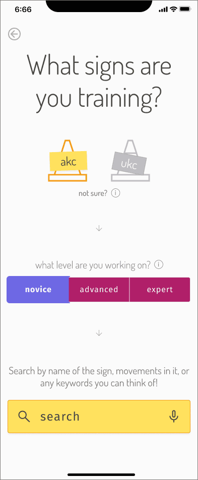
For the homepage. The opening sequence. The prelude. This.
I was so excited to use my alternative colors on this. This screen shows the novice filter selected.
And then down to the search bar. Now the instructions have a wee bit of context to them. We’re searching under AKC (or UKC) at X level.
Then we move through the list building process, all the same as before. I am using all the wording of the “record” flow, because at this point we have no future plans.
Now, as you hit that final “done” button on the list, it moves you to this page.
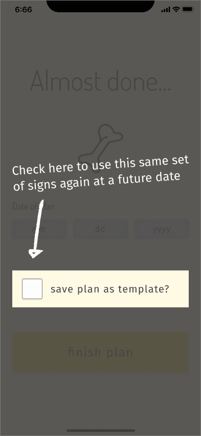
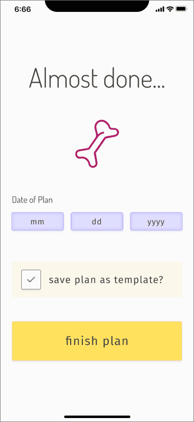
Bam! You can select the date at the end, and save what you just made as a template. A quick, first time overlay explains what a template is and allows you to select it if you want. Then, when you hit “finish plan”, you get this-
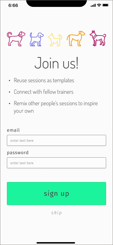
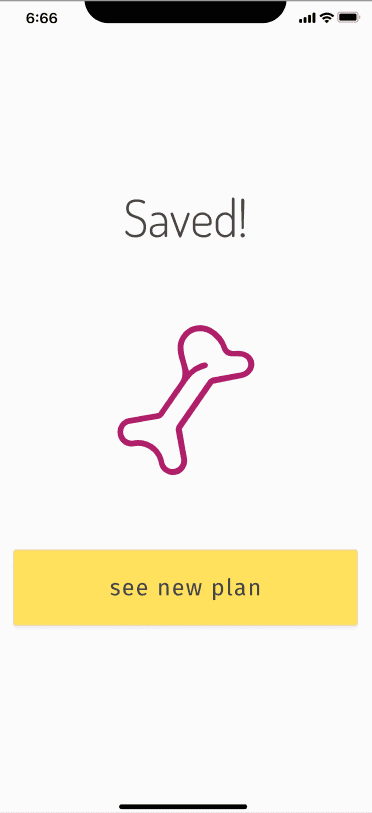
We use the happy green I love so much. And I’m kind of obsessed with the cute, colorful dog icons at the top. The other two screens are just the options if you sign up, or if you skip.
So now… The final test. Would this resolve the issues?
Final User Test
YES. Ok so this test was lighter with just 3 folks taking a quick peek at it and only focusing on the bits I changed with the last update. But YES!!
The change to the home page made folks go from “ummmmm” to just breezing along. The addition of the template option made perfect sense to folk, and they were happy to select it.
You can see my final prototype here.
Final Thoughts
I did find a few additional issues in the flow, and so would resolve those by tweaking the sign up form, rearranging the order of the form in the flow, and letting folks name the templates. But ultimately I did resolve all the major issues uncovered in this flow.
This project ultimately shows how deeply folks training Rally Obedience value community. More than lists or tools, they want to be connected to other people doing the same thing.
Collaborating and training together is a higher priority than anything else, both with other people and with their dogs. We can work in vacuums all we want, but it’s when we get together that meaningful progress is made.