
Social Media
FitLocal - Increase Engagement Project
The Goals
How do we foster engagement with us in an oversaturated market?
FitLocal is a family and friends health tracking app, but users have been dropping off and deleting the app after only 3 weeks. We initially hypothesized adding messaging would be enough to increase and maintain engagement. However, my research indicated we needed more than just messaging. I set out to implement both messaging and social media elements to hook and delight our users.
Getting Started
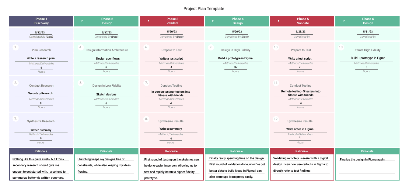
To keep us on track, I wrote a project plan with estimations of work time and delivery dates.
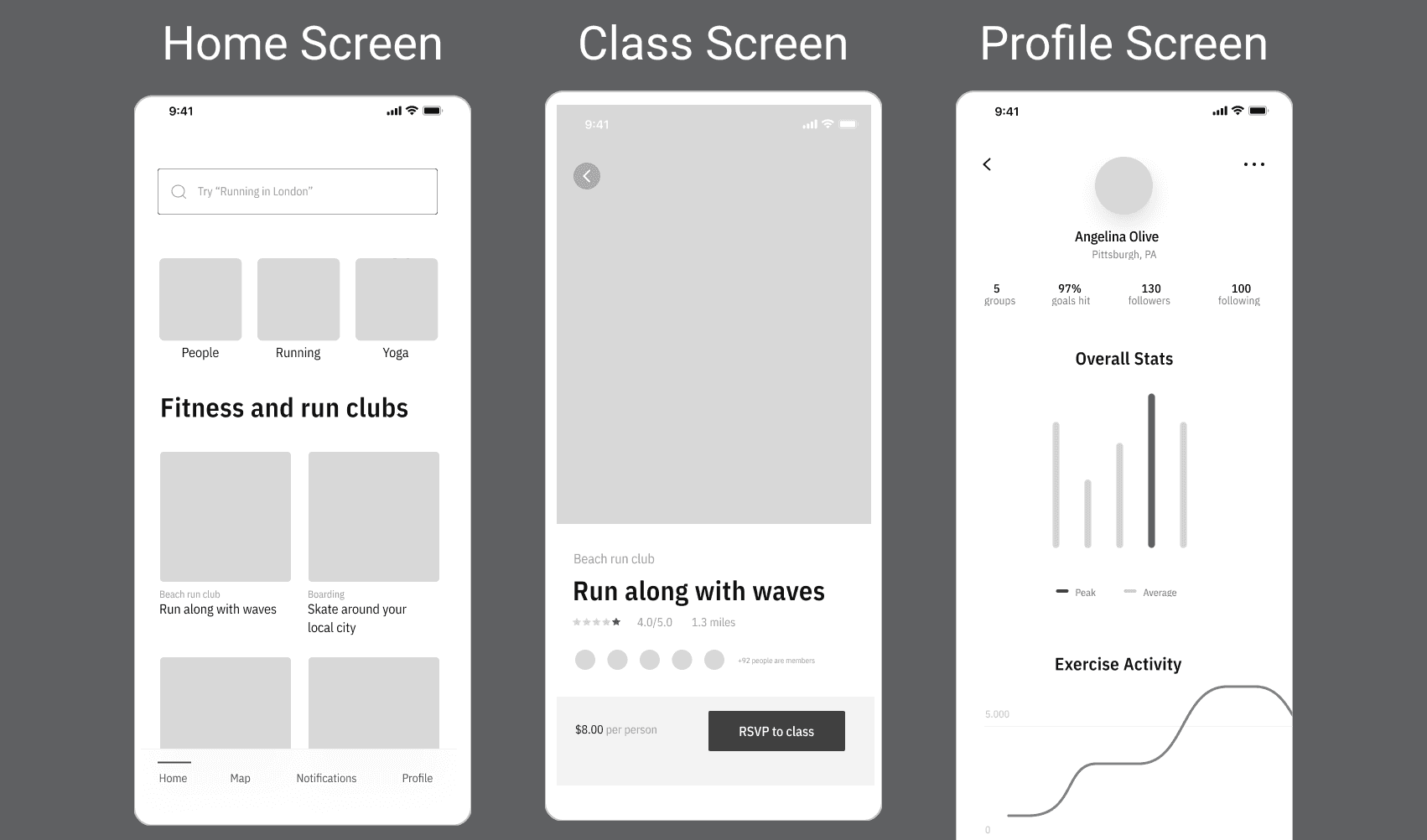
The FitLocal project provided wireframes as a reference to jump off from. While their stated goal was to make this a sharing app, their actual product made it look more like a class finding app.
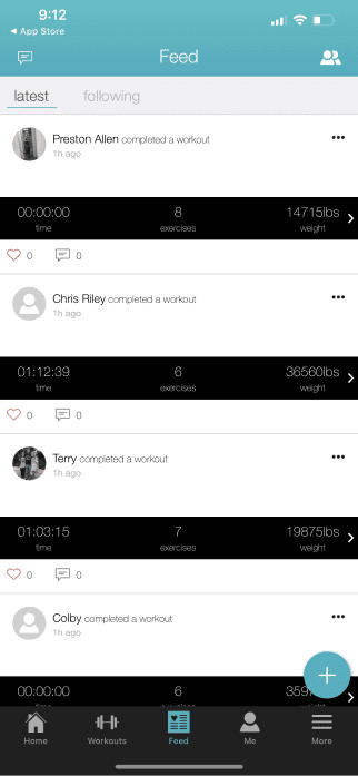
To better understand what we’re dealing with, I conducted market research by deep diving into 4 similar fitness and goal tracker apps.
Fitlist
Productive Habit Tracker
Map My Run
Nike Run Club
At the same time, I gathered data on what our proposed user base is already doing, and what they are looking to do. In this case, this information mostly came via secondary research.
With each app, I broke down the information gathered and compiled it and screenshots into an easily digestible PDF.
As an example, here's what my Fitlist breakdown looked like:
Fitlist
A feed to follow activities of friends and active users
Ability to post status in many areas of the app
Able to follow/interact people you don’t have contact info for
Statuses allow for photos to be included
Can only find people you know by looking up their name- good luck if they have a generic name!
Commenting on other people’s statuses seemed broken
Even the most recent statuses were an hour old. This indicates to me this app isn’t super widely used
Action Items
Include ability for photos, to make more engaging statuses
Allow people to find each other without already knowing each other
Allow people to add friends via phone or email
Finally, with all the collected data, I wrote a 1 page research summary to get into the actual issues our user base is facing.
The Real Problems
My paper quick broke down the following info:
User’s wants and needs
User behaviors
Propositions for what to build and change in order to encourage greater engagement and retention
What I found surprised me: Most fitness and goal apps are not doing a good job of keeping people connected to their friends and family, as FitLocal aims to do. Sure they connect to a larger community, but they do little to facilitate interactions between people who already know each other.
But you know what sort of apps do connect people to each other?
Social media. Events/ticketing apps. Apps that help people share their daily lives and direct them to real life places to meet and engage with one another.
This research turned me down an entirely new path. We already have a class directory of sorts. Let’s mash together Eventbrite/Meetup and social media. Design an experience where users can engage with friends and family on fitness events and their daily fitness journey.
Red Routes
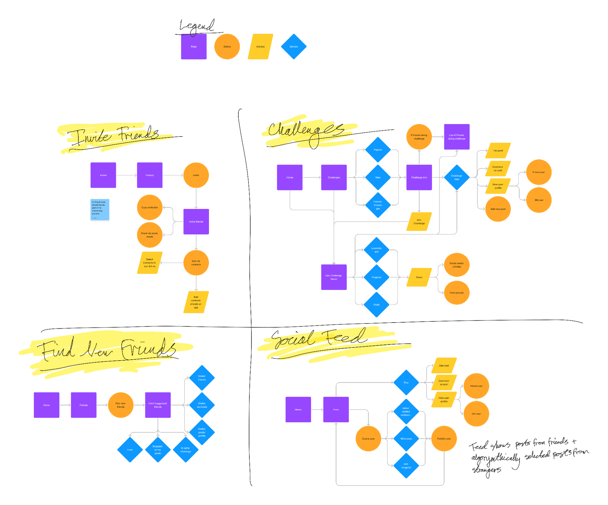
It was time to identify what exactly a user might do and experience while interacting with the app. Nailing down a red route took several tries and a lot of thought. I ended up mapping out 4 potential red routes based on the previous research.
However, I realized that while my maps made sense on their own, they did not match up with the current wireframes and direction of the app. So I smashed together the Challenges and Social Feed red routes to better fit existing pages and to build out the most important parts of the process.
Initial Designs
With FitLocal’s original wireframes in hand, I had a headstart on the build. That said, their Figma files were an absolute mess. I spent 3ish hours just cleaning them up and turning them into a usable product. But it was well worth it in the end.
The Main Goal is still to encourage messaging and engagement with other users, so our strategy was to blend social interaction into the already existing frames with minimal design adjustments.
In this case study, I’ll focus on showing what I changed.
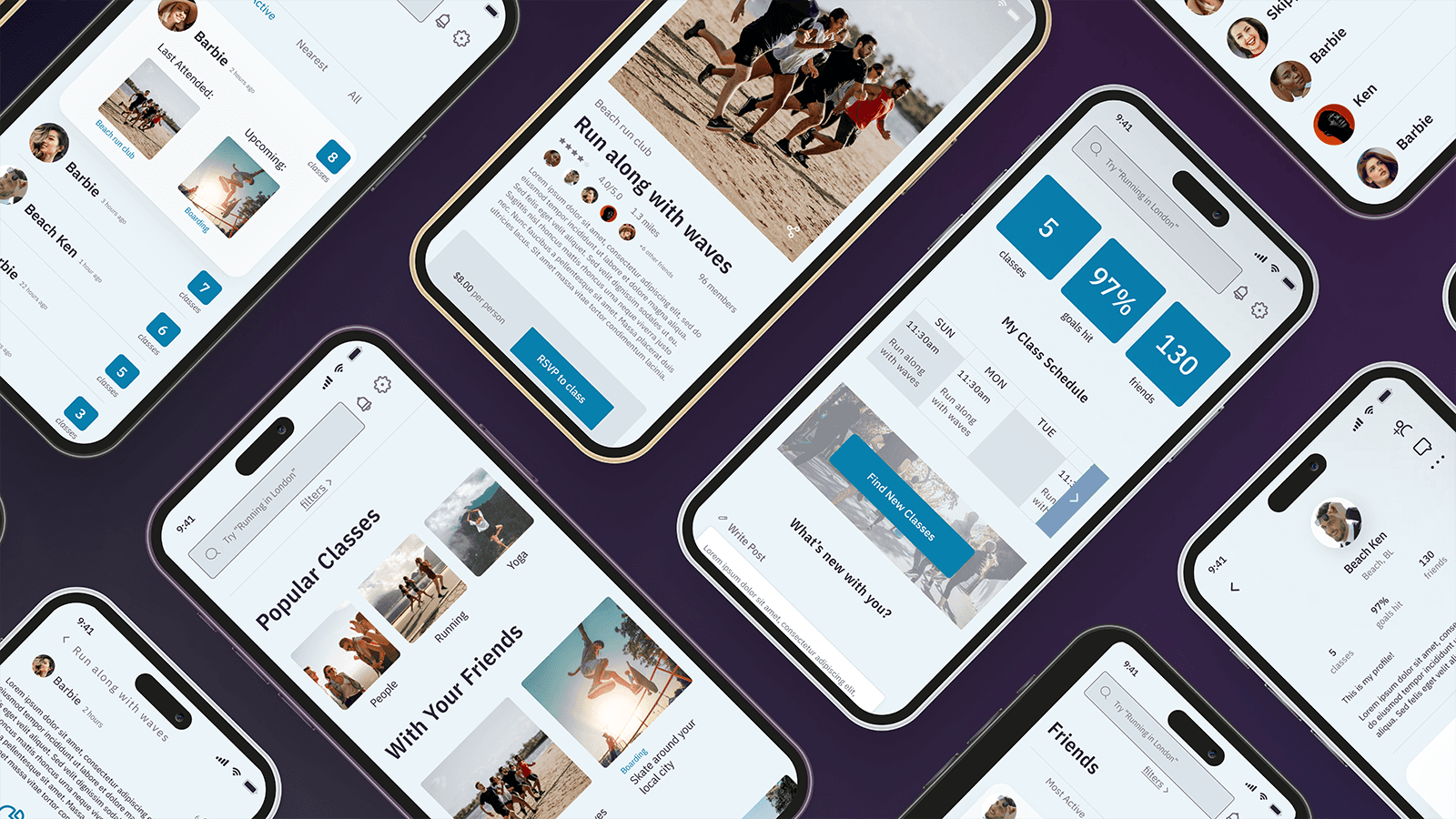
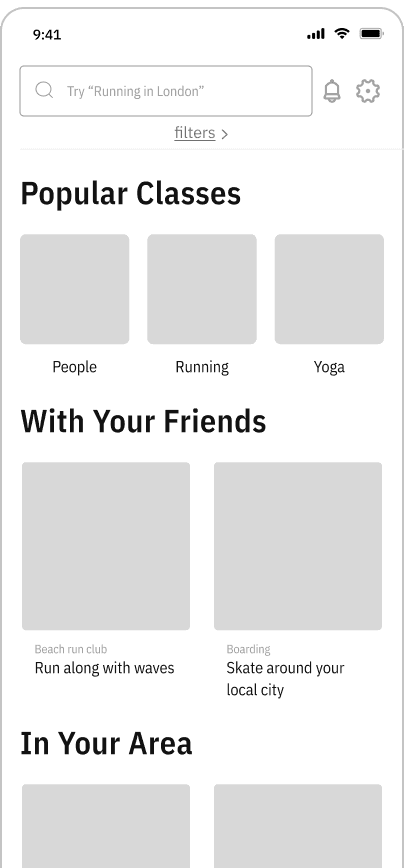
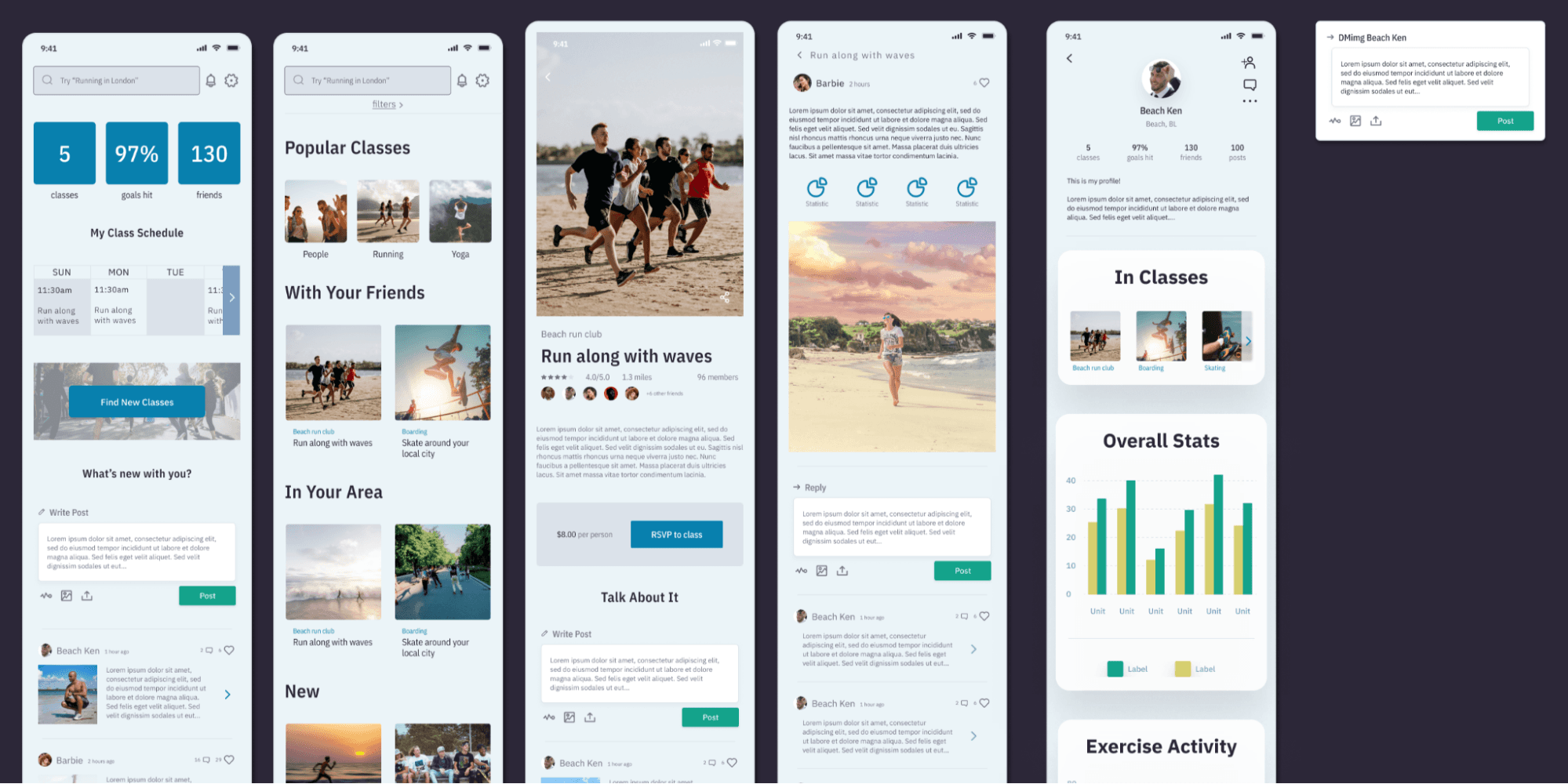
Classes Page
One of these minimal design adjustments was to make the old Home page the new Classes page. I changed very little about the basic layout, but did change and add new categories to show on the page.
Categories added/changed were:
Popular Classes
With Your Friends
In Your Area
New
With Similar Users
The goal was to help users find classes that their friends are already attending, or that nearby users already love.
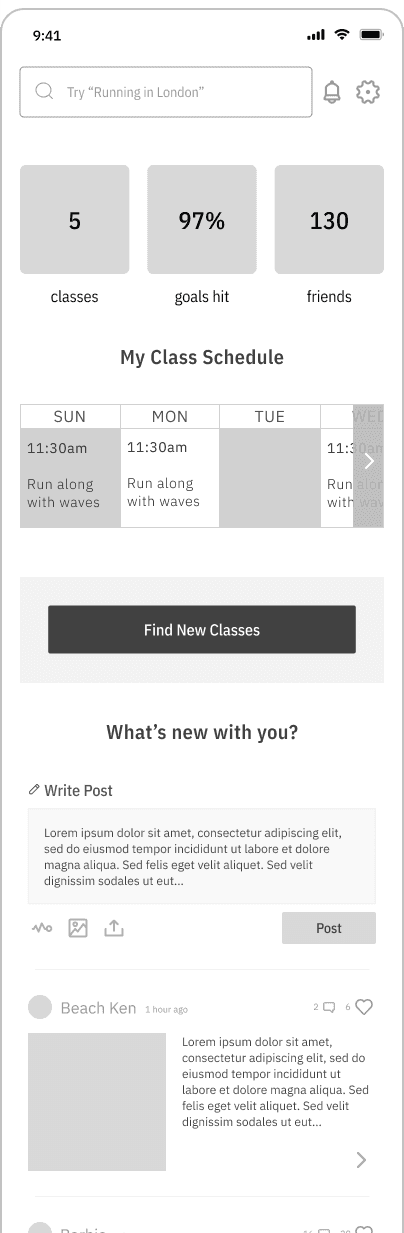
Home Page
Meanwhile I built a new home page to give the user an overview of their activity. The goal is the build a more interesting and useful home page.
User stats
Calendar of upcoming classes
Big ‘ol button to encourage looking for new classes
At the bottom of the home page, the social aspects begin.
Users will be able to share posts about a number of key moments, but this is the most basic.
From here, users can-
Write the body of a general post
Upload media
Include workout stats
Publish the post
They can also view a timeline of posts from their friends. The timeline allows user to-
See a preview of their friend’s latest posts
See when they were posted
Heart them
View the full post
Comment on it
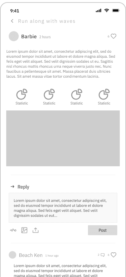
Post Page
We built a brand new page to showcase the full social posts folks are making. These will be accessible from every area there is a post. Click on the preview and you’ll get the full post.
Post body
Statistics
Image
Comments are made here and hearts can be given to outstanding posts.
The goal is to create an environment in which people are talking about their exercises, their classes, their activities- giving folk a way to interact with each other.
Posts will keep being integrated- just wait. ;)
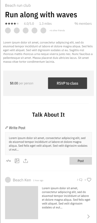
Class Page
The goal with this redesign is to use social proof and interactions to encourage users to RSVP to it.
First, we added the avatars of all the friends attending the class. Who wouldn’t want to miss out on all the fun your friends are having, right?
At the bottom, users can read and write posts that are class specific.
All the functions remain the same, but the topic is this exact class. Did folks like it? What pics did they take? What stats did they reach?
They aren’t reviews. They are simply folk talking about their experience with the class.
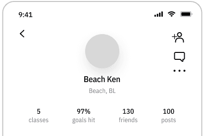
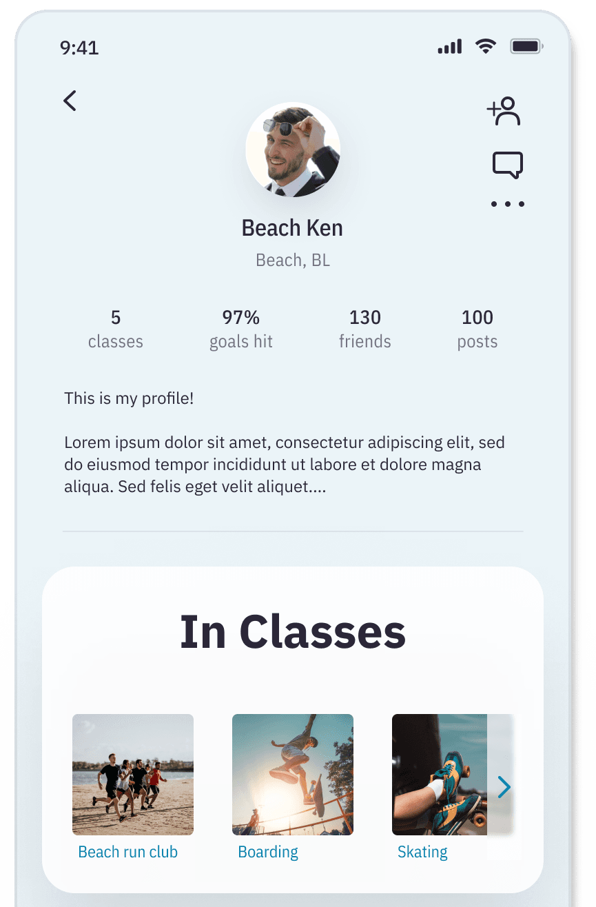
Profile Page
This page also has only a few tweaks.
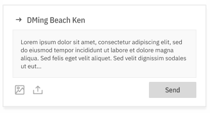
Users can add others as friends and DM them straight from their profile
Profiles are always accessible by clicking the username or avatar of the user.
Prototyping
All prototyping was done in Figma. The goal was to make it feel as real as possible while still spending minimal time on it.
First Testing Round
I interviewed 5 people from our target audience. Most were people I already know, but I had not discussed the project with them prior to this.
I write a 1 page script + outline to follow, with the general aim of seeing if folk can navigate the novel integration of social media and class discovery. The tasks I gave were:
1:
Find a gathering with people who are familiar to you.
2:
Write a post about your chosen gathering.
3:
Interact with someone else’s post about the gathering.
4:
Say you’ve seen someone you like. Figure out how to talk to them.
You always expect to find something surprising during live testing, but I found two surprising things:
1:
The wireframes pages were almost perfectly followed and understood. Only a few very minor tweaks were required.
2:
People unanimously attempted to click the Friends button in the menu
Rather than focusing on Classes > Classes friends are attending, folks tried to go the route of Friends > Classes friends are attending.
While it’s plausible the wording of my questions skewed the results this direction, the consistency of it made me wonder if this should have been the red route I built for. While it’s certainly a valid route to start at the Classes page, it wasn’t what anyone wanted to do at their very first interaction with the app.
I could have stopped there. Taken notes about the next route to build, made the minor tweaks to my current one, then moved on. But I had allotted time to a more in depth redesign of my first iteration, which did not need to happen now. So I decided to build out this new route and the pages associated with it.
High Fidelity + Feedback Incorporation
Time for the prettier versions! My wireframes were easy to jump off of, due to the quality of the wireframing and the attention to detail in the organization of the file.
I made the tweaks mentioned by users, then moved on to the friends page
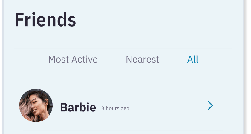
The Friends Page
Route #2 needed only one page: The Friends page. However, it was the most dynamic page I’d built so far.
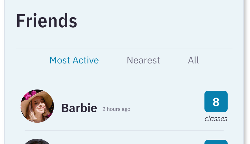
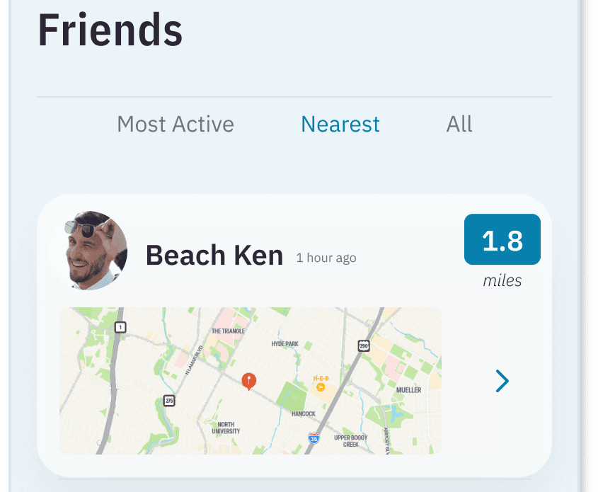
I broke the friends list into 3 categories:
Most Active
Nearest
All
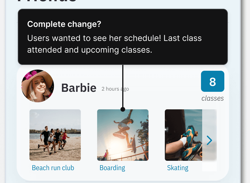
Most Active
Most Active is default because we want users engaging with our best ambassadors. Those users in the most classes will have the most opportunity to help other users find the class they’re looking for.
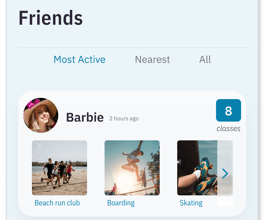
Clicking on users in the Most Active area will expand to show their latest classes. Classes are clickable, which will take users to the Class page.
Nearest
Nearest is there to help users find the friends nearby who may have class suggestions based on proximity.

Clicking on Beach Ken shows his chosen home location on the map.
All
Exactly what it sounds like. Clicking on a friend takes you to their profile page.
Testing Round 2
Again I wrote a 1 page script. And again, I tested 5 users, different from the previous 5 folk. What most intrigued me about this round is how much more users wanted.
We can see her classes now? Cool. But they wanted to see detailed class scheduling.
One user stated “I want to see what has been most recently interesting to her and also what classes she has next. Where can I join her?!”
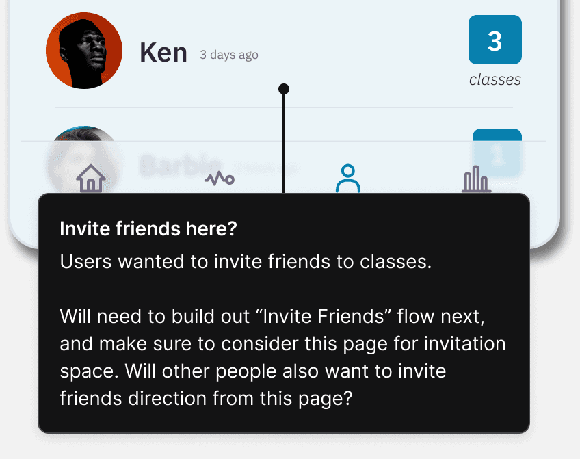
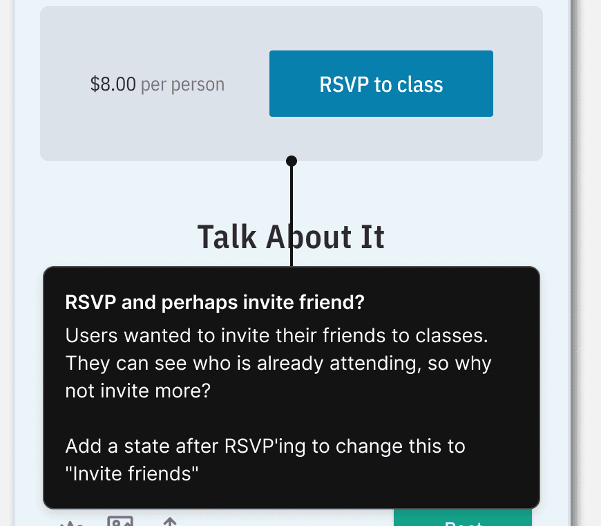
Other users wanted to look at their friends list to invite their friends to their own upcoming classes.
One tester explained, “If I’m going to view all my friends, I’m probably looking for guys to join me where I’m already going.”
As my notation says, we came to the conclusion that while it’s an awesome idea, this would require a whole new flow to be built. At this point it’s much easier to get clarity on how it might flow through the pages we’ve already built.
Perhaps we can put it inline somewhere on the friends page. Perhaps on a profile, under the Add Friend and DM buttons. Perhaps even on the pages of the classes themselves.
I liked these so much I made a few notes with ideas for future flows and builds. But it falls outside the scope of this project, so besides notations, I took no action.
And as for the nearest friends, my users took one look at my little map and essentially went “WTF???” It was a bit brutal. But I must confess, entirely fair.
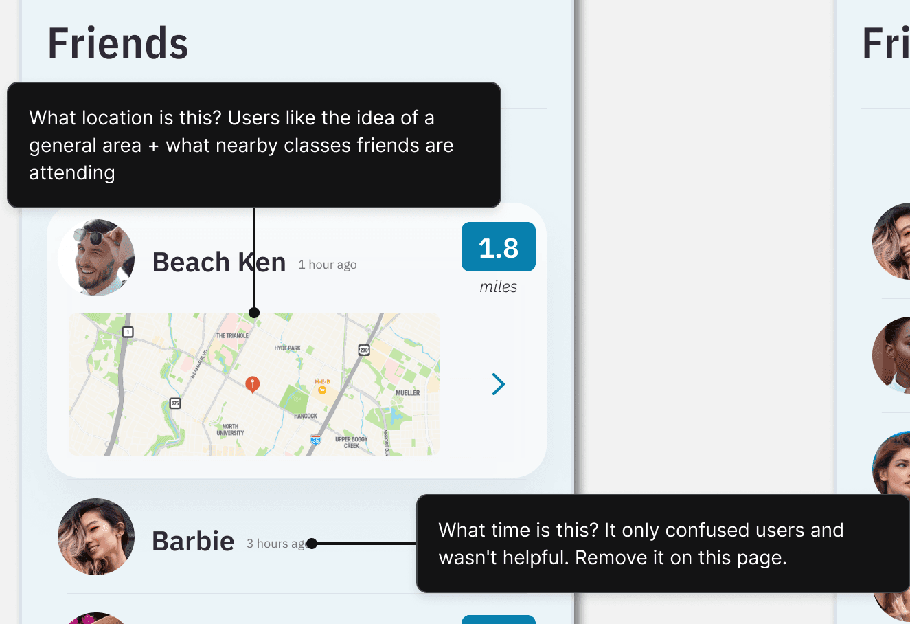
Users initially thought the location was where the friend was last active. Either his last class, or the last time he opened the app. The timestamp helped push this idea. In fact, the location is supposed to be where he indicated his home is. So that friends can gather who is near to who, to make coordinating attending classes together much easier.
However, users were concerned by the presentation.
“I’m not sure I’ll tell a workout app where exactly I live, especially if the app will show it to other people”, said one user who described himself as “a suspicious person”.
I engaged these hesitant users on the entire idea of having nearby friends pointed out at all. I had to explain the intention behind the Nearest Friends, since my design had left it entirely unclear. Once described, users visibly relaxed. It was generally agreed upon that the idea was interesting and helpful, but they did not want their exact locations known by anyone.
One user suggested taking a cue from Craigslist and implementing a similar circular “friend is in this area” marking, along with showing his nearby classes right on the map.
This was so obscenely brilliant I just notated it exactly as the user described it and added it to my final tweaks.
Final Updates
While it was not required by the project to do this last round of tweaks, upon principle I fixed the glaring issues for the final wrap-up.
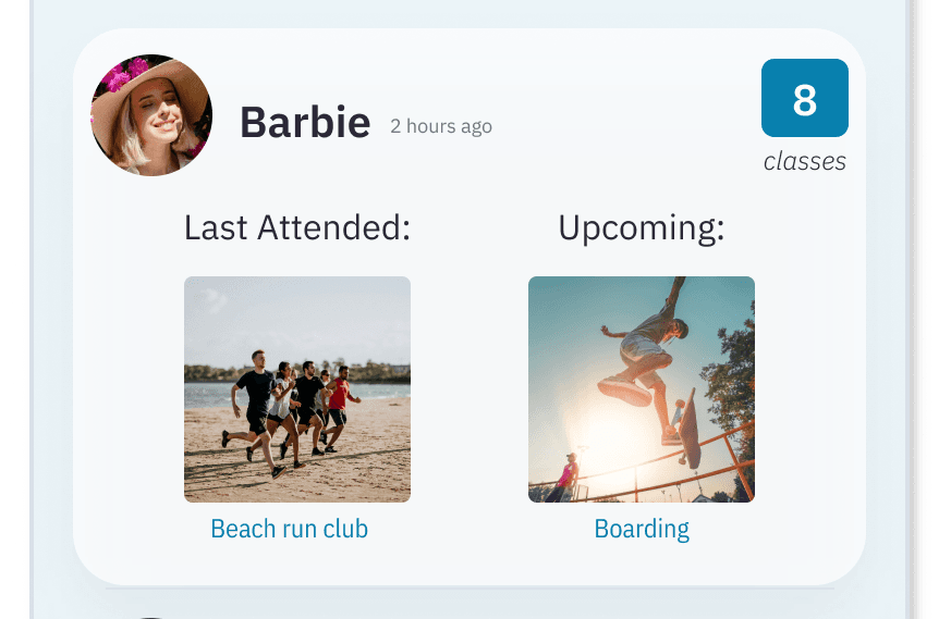
Barbie’s prolific activity is now split out into easy to digest “latest” and “upcoming”.
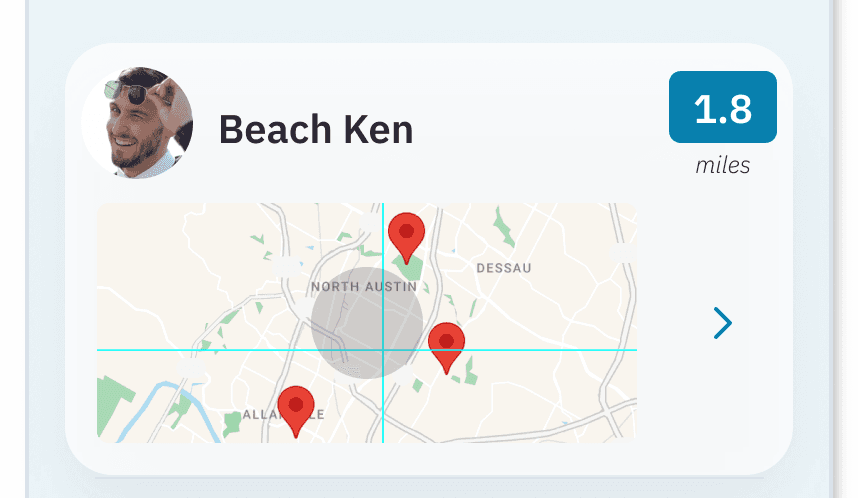
Ken no longer has his home address on blast and instead is shown in a general location, with the emphasis being on the classes he’s taking in his area.
Also, since Barbie (and other friends) now only have a selection of classes visible in the Friends list, I made sure the full list is available on their profiles.
Final Thoughts
This project was a lot of fun to work on. Not only did I have to brainstorm over and over again to solve a complex issue in a saturated market, I also had several important learnings thoroughly reiterated to me:
.
People aren’t terribly adverse to new concepts (social media + finding workout classes) if the design is clear enough.
.
People get excited at the idea of finding and attending workout classes with friends
.
You truly never know what live testing will uncover about your design
.
Sometimes scope creep isn’t entirely a bad thing!
In the end, our users determined this radical approach to finding and attending workout classes may indeed foster increased engagement in the app. And perhaps it will even help people make deeper connections in the real world too.